Web Content
A Practical Writing Pass for More Accessible Web Content
Review meaningful headings, link text, instructions, and image alternatives while keeping accessibility claims limited to actual checks.
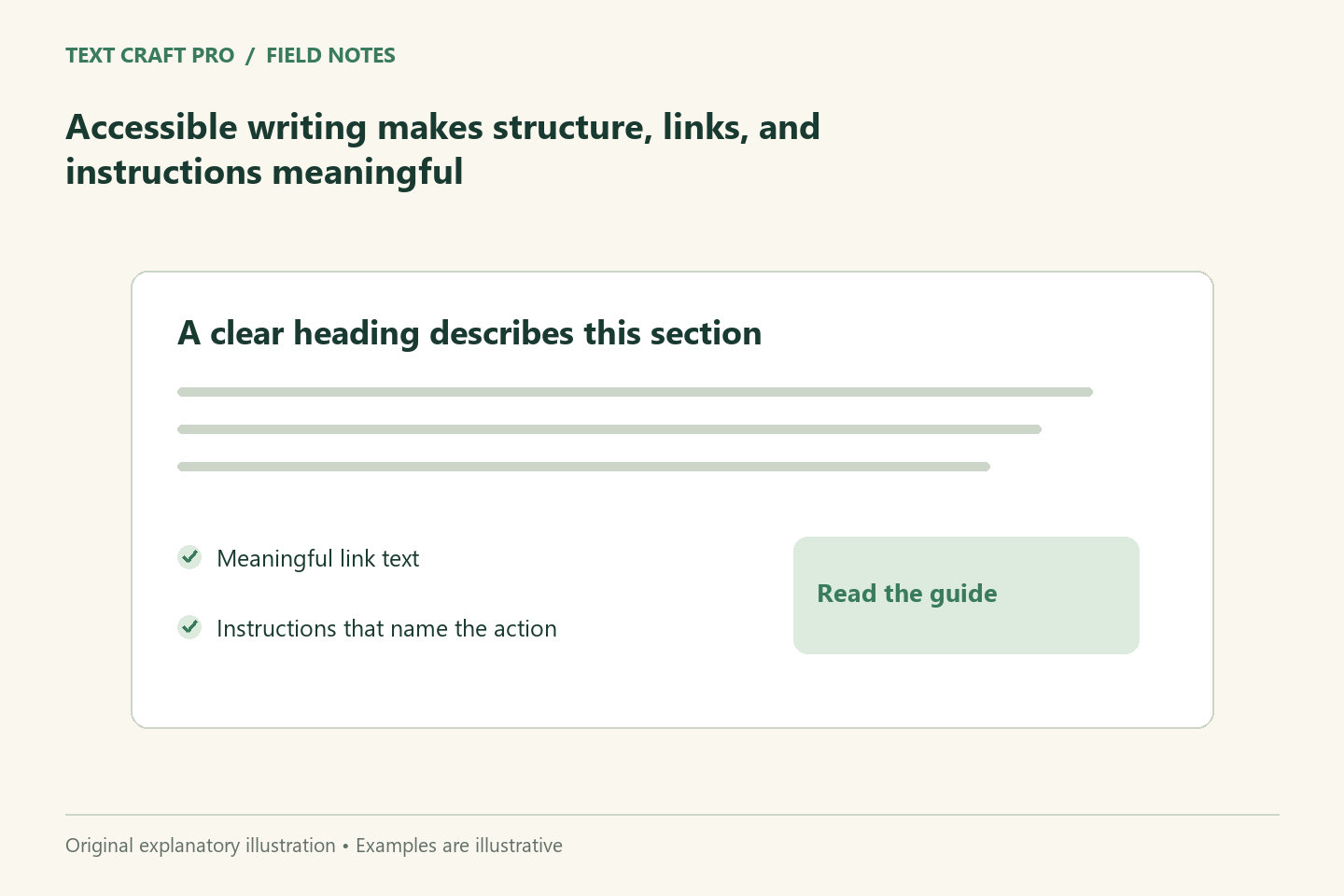
Accessible web writing helps more readers understand and navigate a page. It includes the words themselves and the structure that presents them. A clear article can still be difficult to use if headings are only styled text, links are vague, or instructions omit important information. This guide covers writing checks; it does not certify a site’s compliance with an accessibility standard.
Use headings that describe sections
Choose headings that explain what the section contains. A reader scanning the page should be able to identify the relevant part without reading every paragraph. Use actual heading elements in a meaningful hierarchy instead of changing font size alone. The main heading should identify the page, and supporting headings should organize its content. Check the rendered page because copying material between editors can alter the structure.
Make links understandable
Describe the destination or action in the link text. “Open the content brief builder” is more informative than “click here.” If the destination is a download or a different format, disclose that where it matters. Keep links distinct enough that a reader can choose between them. This is useful for visual scanning and for people navigating through a list of links.
Write instructions that include requirements
A form should tell the reader what information is needed and how errors can be resolved. Identify required fields and relevant format requirements before submission. Avoid instructions that rely only on color, position, or an image. If a tool needs a positive number, say so. An error message should name the problem and a corrective action rather than simply announcing that something went wrong.
Explain meaningful images in context
An informative image needs an alternative that conveys its purpose. A decorative image can use an empty alternative when it adds no information. Complex diagrams also need an explanation in the article; a long label alone may not give the reader a useful experience. Do not place the only important instruction inside an image. The page should remain understandable when that image is unavailable.
Test a fictional tool instruction
Vague wording: “Enter it below and press the green button.” Clearer wording: “Enter the article’s word count and your estimated reading speed, then select Calculate reading time.” The revision names the inputs and action without depending on color or location. The actual form still needs programmatic labels and usable controls. Good wording supports those technical features; it does not replace them.
Record the scope of checks
Use keyboard navigation, narrow-screen previews, and relevant accessibility evaluation methods as part of a broader review. Report what was actually checked and what remains unknown. A writing checklist does not prove full compliance, because accessibility also depends on code, interaction, media, and user testing. Give readers a contact route for problems and maintain the page as its content and tools change.
Frequently asked questions
Does plain wording guarantee accessibility?
No. It helps understanding, but structure, controls, keyboard behavior, media, and other technical factors also matter.
Should every image have a long description?
No. Describe the information or function it contributes. Decorative images may use an empty alternative; complex visuals need appropriate supporting explanation.
Further reading
Continue your workflow
- How to Write Image Alt Text That Fits the Article
- A Plain-Language Editing Pass That Preserves the Meaning
Was this guide helpful?
Tell us what needs improving →
Your selection stays on this page. To send feedback to the publication, use our contact form.
Published 26 September 2026 · Text Craft Pro · AI-assisted educational writing. Editorial policy · Suggest a correction